EVNTL
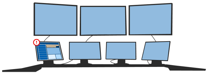
My first position after graduating saw me take on the role of UX/UI Designer for a 15-person startup security intelligence firm that helped shape my early career as a designer. Reporting directly to the CTO, I was tasked with improving the interface and user experience of an MVP dashboard web application while implementing preliminary but foundational design processes that the business would use well after my departure a year later. My time at EVNTL was a period of rapid growth and maturity, solidifying my place as a designer in the tech industry.
EVNTL is home to an AI-powered critical-breaking news dashboard web application with a native iOS application. Using Twitter APIs and machine learning algorithms to scrape for certain keywords, the dashboard pushes breaking news events to the user in the form of summarized headlines and geolocation data along with metrics assessing the accuracy and validity of each news event. The dashboard contained a menu/navigation sidebar, along with a two-panel main layout making up the bulk of the interface. The left-hand panel consisted of a continuous stream of critical-breaking news items that could be expanded in the right-hand panel. A couple of months into this role, I designed a newsroom-style ticker that would stream horizontally across the top of the interface housing the most impactful news events of the day.
The dashboard was intended to be used in the control rooms of companies like Garda and Brinks to supplement the monitoring of critical news that could potentially affect their assets. MLSE also expressed interest in the product, citing the utility of the soon-to-be-launched geolocation features that would allow them to monitor news around stadiums, hotels, and bus routes. The investor team was comprised of ex-CSIS and ex-Peel Regional Police personnel which served as entry points into my research on the dashboard’s user base. Through user interviews, I ascertained the dashboard's desired context of use and how it could fit into the existing workflows of security and intelligence users. This research was integral in laying the groundwork for the next generation of the dashboard moving from a developer-designed MVP to a fully fledged web application.
My work began by building a design system and component library in Sketch using Material UI. While this was my first time using an off-the-shelf design system, I quickly learned the ins and outs of the relevant components, delivering medium-fidelity desktop prototypes just after my probationary period had ended. To ease the workload on the developers, I only modified a handful of components, choosing my battles wisely. A month later, the native iOS design system was completed and medium-fidelity prototypes were delivered. This initiative was unique in that I had very little inspiration on which to base my designs. The business was set on the two-panel layout so my attention shifted to ensuring a robust information hierarchy ensuring that key information could be quickly gleaned by users. The guiding principle was to present the data most pertinent to a user’s decision-making as the most salient. Graphics to convey a critical-breaking news event’s accuracy and validity alongside tags to categorize these events, with Google API map components to communicate location were deemed to be the most important, with the news headline being the most salient.
As the sole designer on staff, I led a lot of the graphic design work at EVNTL. Below are some examples from logo brainstorming session I led.


Tools
Sketch
Adobe Illustrator
Material UI
Apple’s Human Interface Guidelines
JIRA
Asana
Skills
Design System
Component Library
User interviews
User flow analysis
Graphic design
Agile user-centered design