QR Code Ordering for Festivals and Markets
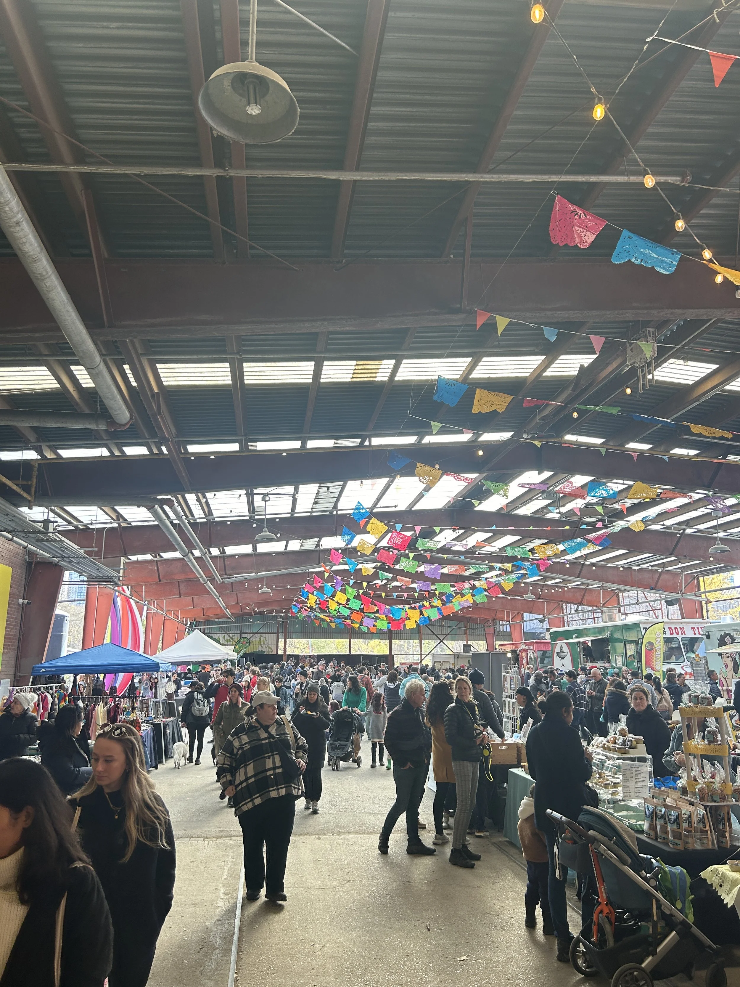
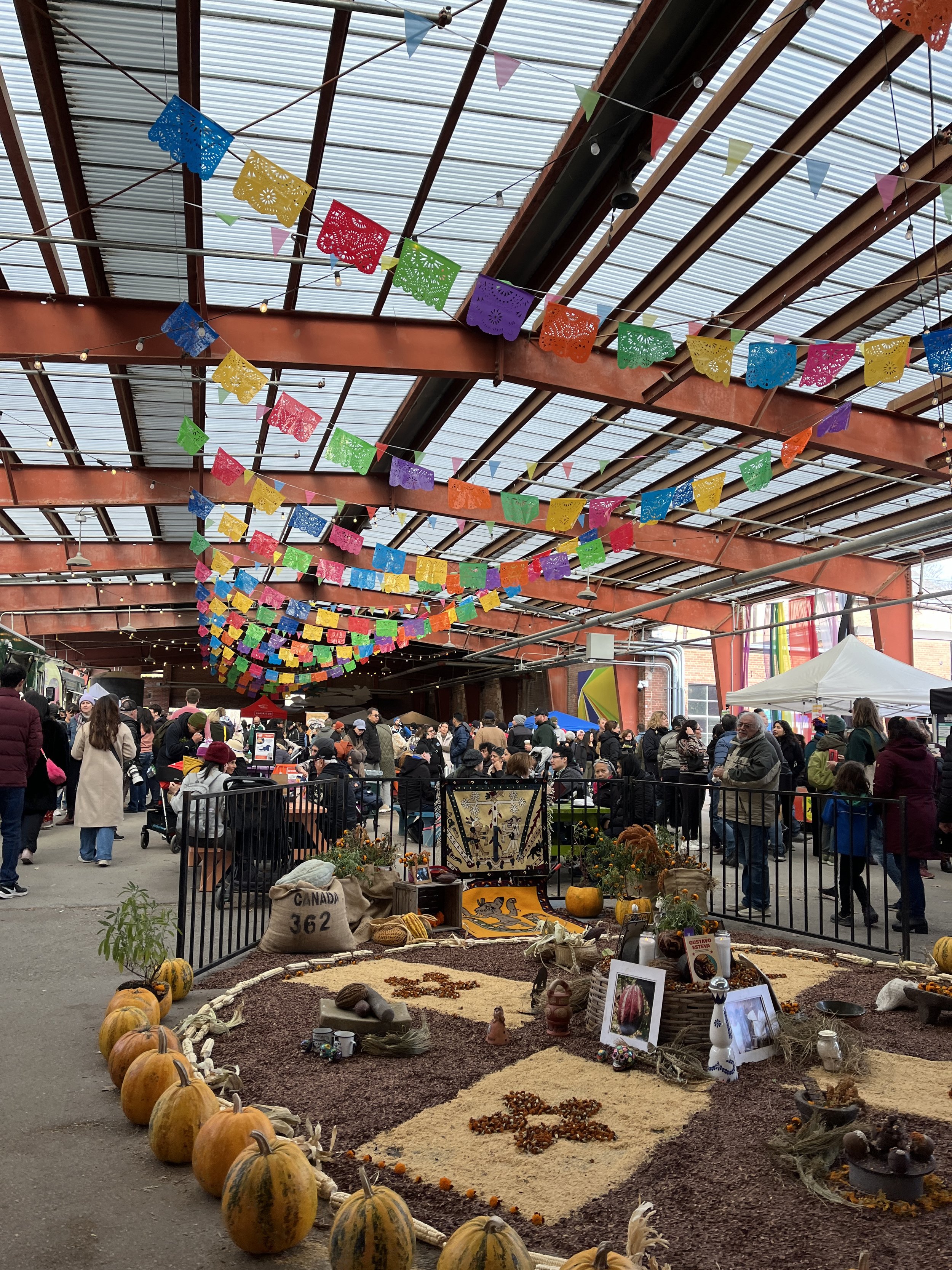
My next portfolio piece follows from reflecting on the food buying experience at Evergreen Brickworks’s Dias de los Muertos market in early November. This coincided with an interview with Lightspeed Commerce, a Canadian tech company serving the POS needs of small and medium-sized businesses. Both these experiences got me thinking about the direction food transactions are headed and how they may alter existing user experiences.
Simply put, if the QR code is going to move physical menus to our phones, then there is little reason why payment cannot occur on our phones too. Certain demographics are already accustomed to this technology, and I wouldn’t be surprised if it were commonplace in many parts of Asia. East Asian eateries were the first to use tablets for All You Can Eat forms of dining and I expect this subset of the Canadian population to further lead the charge in digitizing more of the dining experience.
When Laura and I sat for lunch at Grandpa Thai just south of Yonge and Finch for a quick lunch date this past spring we were greeted with QR code stickers both to access the menu and later to pay, in what was a fairly seamless user experience. Now my memory is a bit foggy so bear with me as I outline two of the possible user flows:
Scan QR code to obtain menu.
Select what items to order.
Server comes to our table to see if we are ready to order.
Server retrieves our order.
Scan QR code again to pay.
Pay through link.
OR
Scan QR code to obtain menu.
Order items through link.
Scan QR code again to pay.
Pay through link.
The difference hinges on whether the entire user flow took place in the QR code link or if our waiter alleviated some of the data entry required on our part by verbally taking our order. After putting our heads together, Laura and I believe we went through the 2nd user flow. This meant our contact with the staff was minimal and we avoided having to flag down our server for the bill.
A quick peruse of Grandpa Thai’s website jogs my memory. Powered by QuickPOS, the ordering portal is simple albeit with a dated and crowded UI. While there are pictures for most items, a luxury most physical menus don’t afford, there are 13 tabs across the top of the site, each for a different type of food or drink and a primitive search modal window. Regardless of the strengths or weaknesses of this particular iteration of the technology, it is “directionally correct” in that it is on the right track. It was innovative in its ability to save us and the busy staff at Grandpa Thai a couple of minutes of our time.
While the seated and market/festival dining experiences differ in many ways, their user flows overlap when ordering and paying for food. However, the latter experience has no set user capacity. The number of “tables” is variable, there can be 10 people waiting in line for food or 30. These lines take up physical space during markets causing commotion and crowdedness while taking time away from experiencing the market to its fullest. Both these problems are solved by a QR code ordering and payment solution. In this portfolio piece, I will design this experience including wireframes for patrons and vendors taking into account the context of use of both sets of users, using the Dias de los Muertos market as a case study.
Understanding the Space
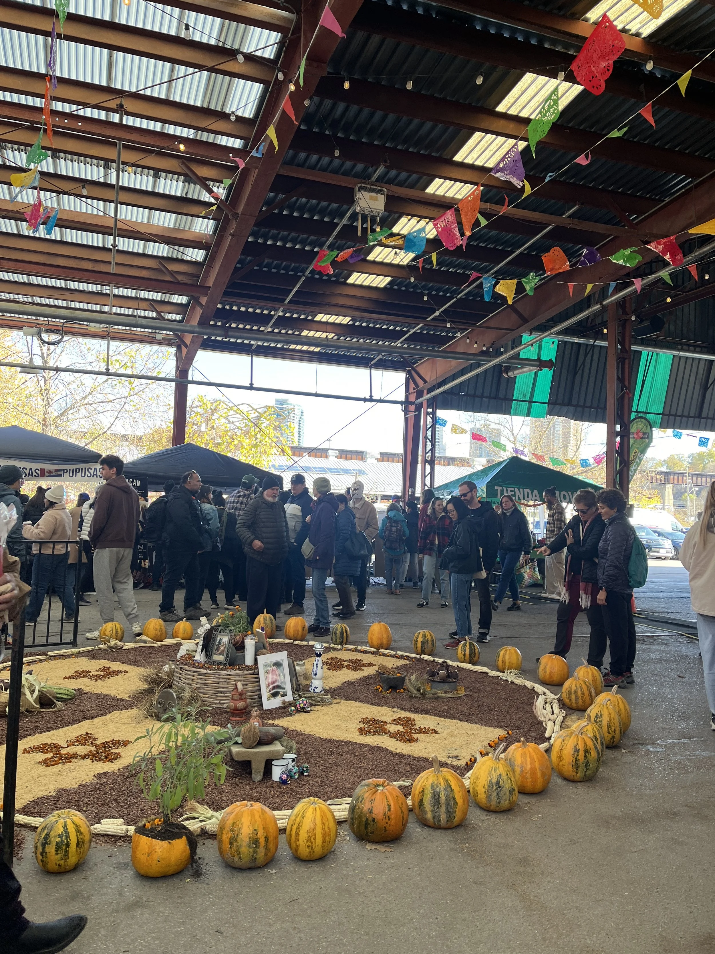
First let’s get a sense of the Brickworks space to better understand the stress the long food lines put on the movement of people in southern part of the North Pavilion. From memory, I’ve sketched out roughly how the food lines impacted the walking routes from the South Pavilion stage to the goods vendors at the back half of the North Pavilion. The lines also affected patrons dinning at the picnic tables along the centre of the space. Patrons would have to push through 3 sets of lines on either side of the North Pavilion. It was hectic and confusing with patrons bunching up at the front of the lines to access condiments and drinks. While there were several exit points out of both pavilions in the event of an emergency evacuation, the lines still made navigating the space cumbersome.
I’ll note that a mobile ordering solution may not completely alleviate the stress on the space surrounding the food vendors as people have a tendency to hover around stalls waiting for their food. The solution must account for this by encouraging dispersion by providing accurate wait times and giving patrons ample warning about when their food will be ready. I’m reminded of the IKEA returns queuing system that informs shoppers of their position in line through a link sent to their phones. Such a requirement will likely be incorporated into my solution.
Understanding the User: Vendors
Now let’s move on to the food vendor stalls and explore how they operate to understand how a QR ordering system may affect their workflow. The user flow of the cashier looked something like this:
Take orders from patrons.
Input orders into your cell phone POS app.
Present your cell phone to the patron, communicating the total price.
Accept cash or the patron taps to pay. In the latter case, verify that the transaction successfully went through.
Call out the order to a coworker. (This can also happen after Step 2)
Retrieve drinks from the cooler if the patron’s order included drinks.
Your coworker makes a plate and hands it to the customer or hands it to you who then hands it to the patron.
This user flow is a form of Just In Time (JIT) system where plates are made to order. This is the case primarily because there is little room in the stall to store plates waiting to be picked up by patrons. This is unlike a restaurant where plates are assembled with components from different sous chefs and then placed on a surface to plated and picked up by wait staff. Therefore, the QR code order system should avoid imposing this spatial requirement on the stall. Real estate is tough to come by in these markets and food trucks or carts are already cramped. Also unlike restaurants that use physical ticketing systems, we want to preserve the order call-out system of these vendors. The cooks have little need to be informed of what orders are coming up in the queue. While there is value in a sous chef seeing 5 orders of rapini across 3 tables informing the size of the batch they cook, these food vendors function best simply by preparing the order in front of them.
Gathering the Requirements
A Note on Food Ordering Apps


The most important design question for a successful solution is what information to include in order components in the order queue. First, I’ll look at all the data and metadata associated with an order and whittle things down.
Order contents (dishes, drinks)
Order notes (unique freeform specifications input by the patron)
Order price (before or after tax)
Order time (12:45 pm) and elapsed time (ex. 10 mins ago)
Order state (Canceled, Updated, Started)
Name on order
Place in queue
It’s helpful to refer back to the vendor’s user flow when determining the most pertinent information to include in an order component. With payment occurring through the QR code, the vendor can focus solely on order fulfillment which requires just three pieces of information; the order items, any order notes, and the patron’s name, alongside buttons that move an order through its states. All other information can be viewed under the expanded order view.
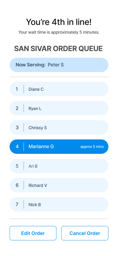
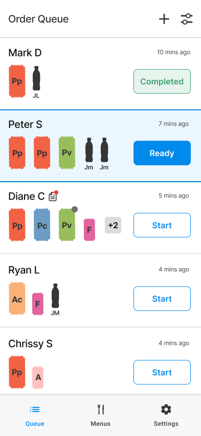
The two screens to the right are my first attempt at the order queue and expanded order view. The order component contains abbreviated colour-coded dish tickets, the patron’s name, an icon to communicate the existence of order notes and a status call to action button.

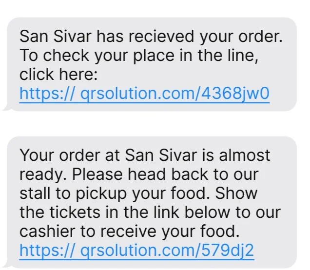
Example text messages sent to patrons throughout the order process.
Now that we have a good sense of how the existing system functions we can formulate how the new QR code ordering system would work. I’ve written the following requirements and user stories for patrons and vendors. First the user stories:
As a market patron, I want to be able to scan a QR code at a vendor’s stall to order and pay online to avoid waiting in line. I want to be updated on the status of my order until my food is ready, checking my place in the queue if necessary, so my food is not sitting cold while I explore the rest of the market.
As a market vendor, I want patrons to be able to scan a QR code to order and pay for food at my stall so I can focus on food preparation. The ordering system should inform patrons once their food is ready to avoid prepared food lingering in my stall and taking up valuable space.
Patron Requirements
PREQ1: The user must be able to scan a QR code with their mobile phone at a food vendor’s stall. The link must navigate the user to the online ordering system.
PREQ1b: The system must be able to input the orders of patrons who do not have a mobile device.
PREQ2: The user must be able to input and pay for their order through the QR code link.
PREQ2b: The user must be able to place an order through the QR code link but pay in cash at the stall.
PREQ3: The user must be able to input their mobile phone number during checkout to receive notifications about their order. Users using services like Apple Pay will have a phone number connected to their card but will still need to confirm that this number is accurate.
PREQ4: The user should have the option to receive a receipt in their email or view it in their browser.
PREQ5: Users must be informed when their order is almost ready. “Almost” will be defined by the vendor but is generally between 2 to 5 minutes depending on the size of the market.
PREQ6: Users should have access to information about their spot in the queue.
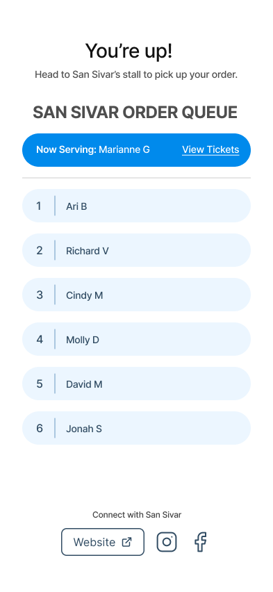
PREQ7: Users must be informed when their order is ready.
PREQ8: Users must confirm with the vendor that they are picking up the correct order.
PREC9: The user must be able to update an order within a reasonable time. “Reasonable” is to be defined by the vendor and will depend on where the user’s order is in the queue.
PREC10: The user must be able to cancel an order and receive a refund within a reasonable time after placing the order. “Reasonable” is to be defined by the vendor and will depend on how lenient they want their refund policy to be.
Vendor Requirements
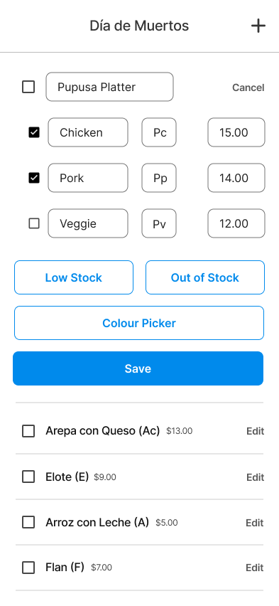
VREQ1: The vendor must be able to configure their menu in the system, including uploading pictures of each dish.
VREQ2: The vendor must be able to view a running list of orders placed in the system. The vendor should also have access to a complete history of orders with the ability to search and filter them.
VREQ3: The vendor must be able to select when an order is started.
VREQ4: The vendor must be able to select when an order is ready.
VREQ5: The vendor must be able to update an order and have the system ask the patron to pay the difference through the app or issue a partial refund while notifying the user. The user should be able to pay or be reimbursed in cash with the patron marking as such in the system.
VREQ6: The vendor must be able to cancel an order and have the system issue a refund while notifying the user.
VREQ7: The vendor must be able to verify with the patron that they are picking up the right order.
VREQ8: The vendor must be able to mark a dish as sold out, preventing further orders of the dish. The vendor should be able to mark a dish as low quantity and a warning should appear in the online ordering system.
VREQ9: The vendor must be able to mark in the system when a dish has been picked up.
System Requirements
SREQ1: The system must inform users that their order has been placed successfully and send them a link to view their place in the queue with an estimated wait time.
SREQ2: The system must send a receipt to the user’s email associated with their credit card.
SREQ3: The system must inform users when their order is almost ready to be picked up using an algorithm calibrated to the vendor’s food preparation speed.
SREQ4: The system must inform users when their order is ready with a link to a confirmation screen to show the vendor.
SREQ5: The system must inform the user when their order has been updated or cancelled including a link to resolve the conflict by a) paying the difference online or by cash, or b) confirmation of a partial or full refund.
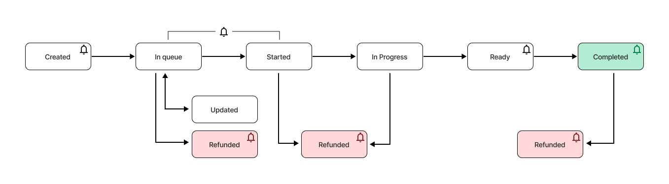
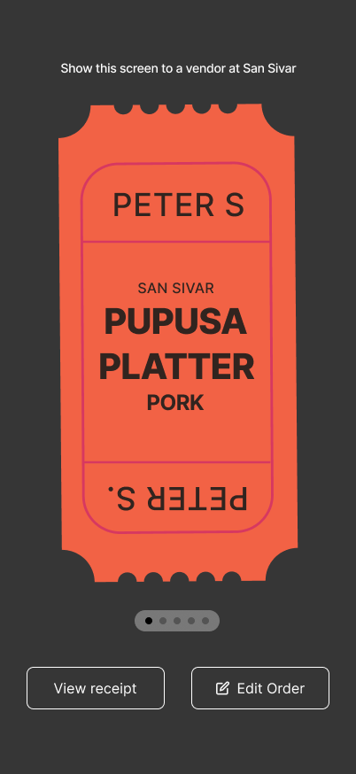
Reflecting on the requirements listed above, it is clear that an order passes through various states before completion. Additionally, in certain states (marked with a bell) the user is notified via an SMS message about their order. The state diagram above describes the status requirements of the QR code order system. The bell straddling the “In queue” and “Started” states indicates that a notification can be sent to the user anywhere during these states depending on how fast the queue moves. For example, if the vendor wants patrons to be notified 5 minutes before their order is ready and each order takes about a minute to prepare then the patron will be notified when they’re 5th or 6th in the queue. However, if a dish takes 5 minutes to make then the patron will be notified once the order is started. As we will see on the mockups, there are buttons on the interface that the vendor selects to move orders through states. In the diagram above, allowing users to cancel an order after it has been started is an example of a vendor opting for a generous refund policy. Vendors should be able to personalize their refund policy under the system’s settings. On this note, you’ll see that the 4th screen has an “Edit Order” button while the 5th screen does not. This is because editing is enabled when viewing tickets when a patron’s order is in the queue.
The Vendor-Side Solution

Moreover, pressing “Ready” to notify a user who is likely already at the stall, could be tedious and superfluous. While taking these actions helps to both clean the queue of old orders and inform the system so it can provide future patrons with more accurate wait times, from the vendor’s perspective their benefit is marginal, especially compared to how they worked before adopting the QR code ordering solution. Simply put, these actions benefit the patron’s market experience by alleviating the market space of long lines and freeing up the patron’s time. Vendors are not incentivized to act on this problem because they are not affected by the negative externalities of long lines. With this in mind, the system must be able to sell the following trade-off to the vendor.
“The QR code ordering solution alleviates vendors from spending time inputting orders to process payments and complete credit card transactions. Labour can be redirected to food preparation or reduced entirely, saving you money. The area around your stall will be less crowded and your patrons will be able to enjoy the market to the fullest now that they don’t have to wait in line. It may attract more patrons because they see you saving your customer’s time.”
This is a common form of economic trade-off that frees up capital by implementing more rigid bureaucratic processes. More generally, some forms of technological innovation occur by standardizing human behaviour to be readily interpreted by digital systems. In return, these systems provide tangible value to producers AND consumers. This is where as a designer, I must deliver “the goods” on applications based on value propositions intended to free up time and labour. That is, our user experiences must actually free up time, not reallocate it to dealing with our technological solution. With the system handling orders and payment, we inherently deliver on this promise but a poorly designed user experience can neutralize this advantage. With proper testing to iron out any remaining smaller questions regarding component design alongside larger-scale usability testing to assess how the system functions in real-life environments, specifically how it meshes with existing vendor workflows, this solution will be well on its way to being a success.
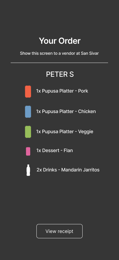
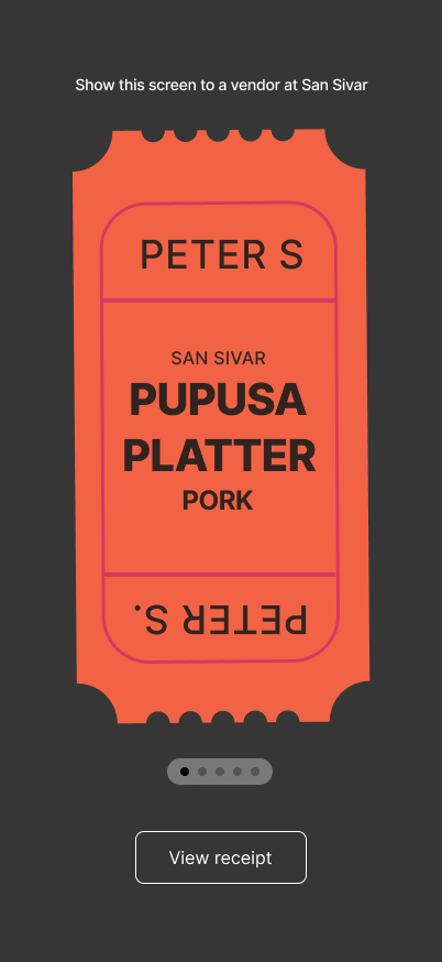
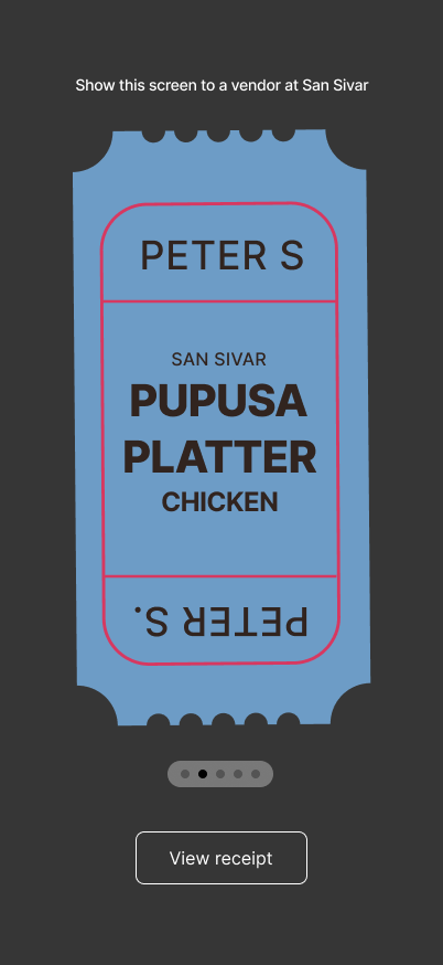
In the past, I would’ve taken this opportunity to design a food-ordering app for patron users. All bright-eyed and bushy-tailed out of university, adding my creative spin on such an app would’ve been enticing. As I’ve become a more experienced designer, I’ve realized the utility of leveraging the user experience of common and state-of-the-art applications to avoid reinventing the wheel. The big players in this space; Uber, Skip, DoorDash, etc. all have similar apps that each get the job done. It’s pointless to add my superficial touch to successful user experiences and interfaces. After all, the crux of making the QR ordering system a success is to make it work for vendors. My design attention will be focused on the UX and UI of their app. Before moving on then, I’ll just briefly draw your attention to the screens below that dictate the messages patrons recieve in the lead-up to eating their food, the queue screen, and the screen they show vendors to formally obtain it.
I’ve designed two options for order pickup screens; a more basic list version and a horizontal scroll ticket UI. The latter digitizes the ticketing system that many vendors still use today employing big and somewhat playful colourful tickets to allow the vendor to quickly and easily see which food the patron has ordered. However, scrolling to view each ticket may be a bit time-consuming. This would be the perfect time to conduct a usability test to determine which method is faster. My design intuition tells me the list option is faster. With big enough ticket icons, the colour of the tickets and the name of the patron should be enough to communicate the order to vendors all at once.
This is a clear-cut case for a mobile-first approach to interface design. While the majority of restaurants and other hospitality industry businesses rely on tablet devices to fulfill their POS needs, as we’ve discussed earlier, space is at a premium in these vendor tents, and personnel is already accustomed to using mobile phones, perhaps alongside a Square device, to take orders and process payment. One benefit to tablet POS systems is that they are used with a sturdy stand so the ordering system can rest in place and be referred to throughout food preparation, freeing up a hand in the process. Mobile stand solutions are much more hit-and-miss and a smaller screen may hinder the execution of a vendor’s processes. While the existing user experience necessitates vendors holding their phones, it would be great if the QR code solution freed up a worker's hands entirely. Unfortunately, this is a requirement the solution must accommodate. A quick Google search returns stands that vary in price and perceived quality with sturdier ones costing no more than $30. My job as a designer would be to test out popular stands and either have the QR code solution recommend which stands to use or provide one with the service.
The requirements above point clearly to a content stream with the ability to select orders, execute any necessary functions, and then quickly return to what I will henceforth call the order queue. This scales up nicely to a tablet view with two panels, an order queue on the left, and an expanded view of the order and associated functions appearing on the right once an order is selected. No matter the device, menu initialization features, order history, and other settings can be hidden away in a menu bar or settings icon. However, because VREC7 stipulates that the vendor must have relatively easy access to edit the menu in the event items sell out, this set of features should be fairly salient.
I’ll note that there are quite a few actions a vendor can take on an order and while design best practices would stipulate presenting the most important actions to the user with the rest hidden under an ellipsis button, I’m uncertain this approach takes into account the nature of the environment in a market stall. I wonder if a super “clean” interface is necessary in this case. While my design intuition has taken me this far, now would be the time to turn to hard data to assist in my decision-making. Under normal working conditions, I would determine how frequently secondary order actions are taken and perhaps run an A/B test to determine how presenting each action contributes to the overall user experience. I would also run a usability test to confirm if vendors can reliably intuit that certain features are hidden under an ellipsis menu and assess if the added task time is a worthy trade-off for an interface that only presents core functionality to the user. While my hunch is that using an ellipsis button is acceptable, it is always best to validate my assumptions.
Lastly, I will further stress that the interface must be able to accommodate a fast-paced and hectic environment. Vendor personnel must be able to quickly identify the dishes they need to make and relay this information to the rest of their team. To satisfy this need, I will use salient colours and abbreviations as visual shortcuts. The motivation for this comes from a glance I snuck at the UI of the pupusa vendor’s phone as they were punching in our order. Dishes were abbreviated with 2 letters e.g. Pa, Mu, Ca, each occupying a big tile on the screen with a different colour background. I will attempt to leverage this solution in my designs.
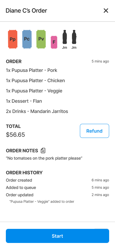
With more space than originally anticipated, I’ve opted to add the elapsed order time to give vendors a sense of how long their patrons are waiting. I’ve also included a marker on dish tickets that have been updated. Whether the dish has been added to the order or changed, I thought it useful to inform vendors. In this way, a vendor looking ahead at orders coming down the pipeline can be notified, albeit subtly, enabling them to update their situational awareness. To satisfy PREQ1b, note that I’ve added an add button at the top of the screen where the vendor can manually input an order. You’ll also note that I’ve opted to forgo the ellipsis entirely in this initial iteration. With more space than originally anticipated, I have room to add a price component that houses a refund call to action button. And as we will see next, actions related to items going out of stock will be configured elsewhere. Lastly, I’ll address the “+2” overflow icon for larger orders. Regrettably, with limited horiontal space, we must force vendors to expand larger orders to view their contents. The business rule I envisioned associated with this limitation would stipulate that viewing priority be given to food dishes. As an example, we see that for Diane C’s order, the drinks are hidden, not the Flan (F), prioritizing the information needed for food preparation, rather than for drinks that usually are retrieved from a cooler.
As I mentioned above, the last part of the vendor’s workflow that the solution must account for is initializing and editing menus. The screens on the left make up the menu landing page and the menu edit screen. The former houses all the vendor’s menus allowing them to edit, duplicate, delete, and create menus from scratch. To edit the stock of items on a menu during a market or festival, the vendor selects a menu and is sent to the screen on the right where they can mark dishes as low or out of stock individually or in bulk. The edit button allows the vendor to edit the dish’s price, name, and abbreviation. Together with the order screens above, the vendor has everything they need to run their stall.
Discussion
I’m fairly happy with how the first iteration of the QR code ordering solution turned out. I’ve produced a clean and minimal UI that simply conveys lots of information which I forsee working well with the fast-paced environment common to these stalls. I’m especially happy with how the colour-coated, abbreviated tickets appear on screen. My chief concerns relate more to the UX side of this solution, specifically how well the solution can accommodate the vendor’s existing workflow.
Managing a queue is no easy task and I fear that the complexity inherent to the order states can overwhelm a vendor, especially those not used to restaurant ticketing systems. Take for example the “Start” action. For simple dishes like pupusas with little lead time needed for preparation, the patron will have already been notified to head to the vendor’s stall so there is little utility to pressing Start.