
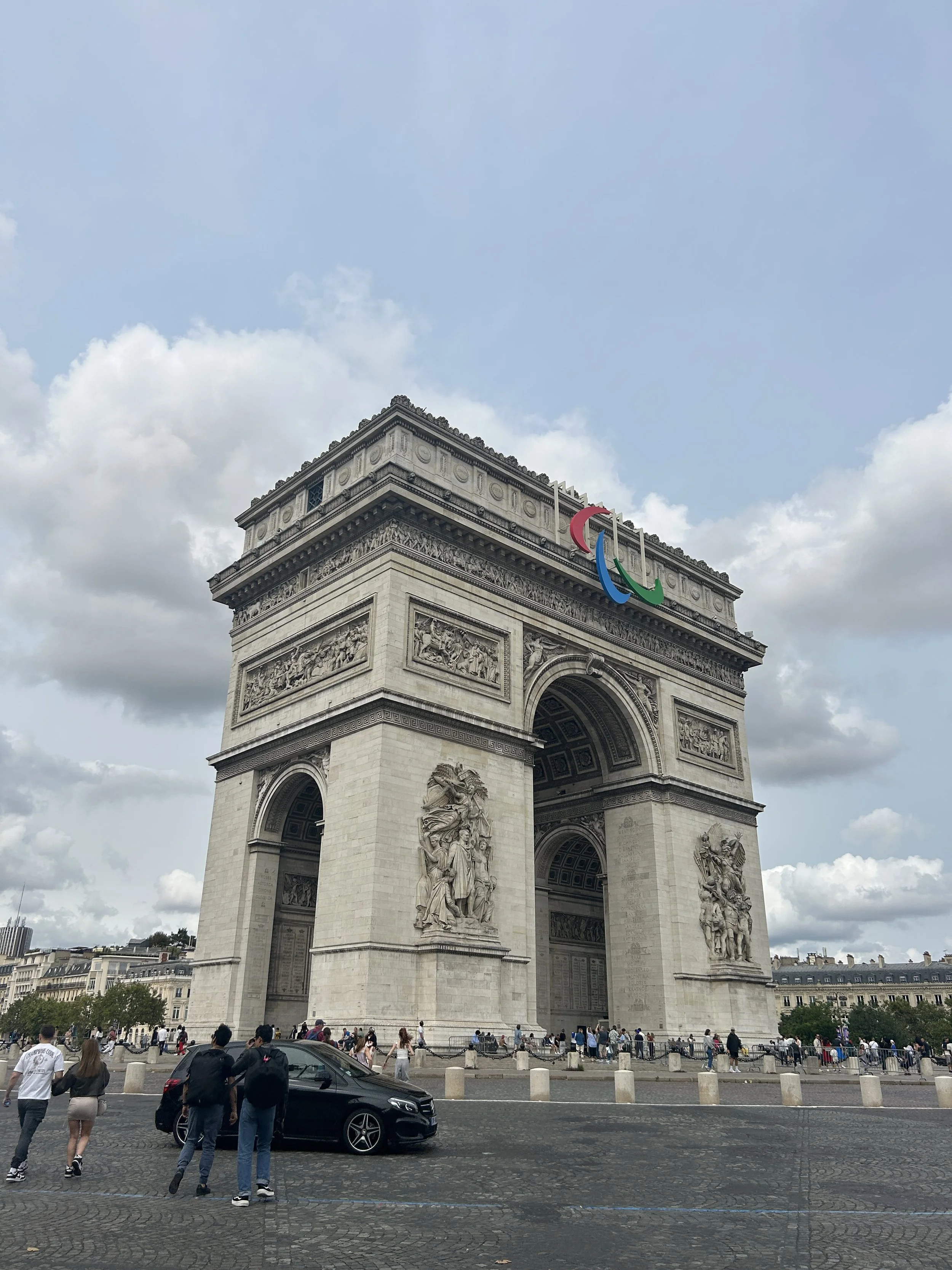
Pictured left to right: The beautiful coastal town of Menton, an olive vendor in the L'Isle-sur-la-Sorgue market, the Arc de Triomphe, Laura and I Eygalières overlooking the Provence countryside, and the courtyard of the papal castle and cathedral in Avignon.
Google Maps Case Study: Itineraries
Going on vacation as a UX designer puts me at the center of several human information systems. I become a user of these systems, often interacting with them for the first time. In a recent family vacation to France, I was able to experience the following systems:
Pedestrian wayfinding on city sidewalks and in museums and public transportation stations
Road system way-finding on highways and municipal streets including interactions with toll collection booths
Public transportation mobile applications and payment kiosks as well as subway and bus routes
Cultural systems that enforce unique norms and traditions (more on this later)
Much like how users of digital interfaces interact with software for the first time, I successfully navigated these systems, using my travel experience and the assumptions and intuition this experience affords me about how the world works. While space and time separate us all, there are consistencies across these systems that I leverage to my advantage when traveling abroad.
Many of the systems listed above can be effectively navigated with a single app: Google Maps. In the arms of an eager tourist, Google Maps standardizes and streamlines almost everything. Language barriers become less of a problem, navigation is as simple as knowing the address of your destination, all while being a couple clicks away from vast stores of cultural knowledge with a simple Google search. However, I found myself wanting more from the product in a specific way illuminated in the user story below.
“As a user planning their itinerary for the day, I want to be able to see where the all possible sights I want to visit are located in relation to each other on a map.”
When traveling with 4 other equally opinionated Arcuris and 1 beautiful Prieto (Laura, pictured above), everyone has different sights they want to see. Using Google Maps, I wanted the ability to throw everything on a map and then find a reasonably efficient walking route that would check off enough of the sites to satisfy everyone. Some stops would have to be ruled out and others added at the last second. There are two ways Google Maps allows you to do this, however, I would consider both of these to be workarounds that did not fully satisfy me as a user. Let’s dive in!
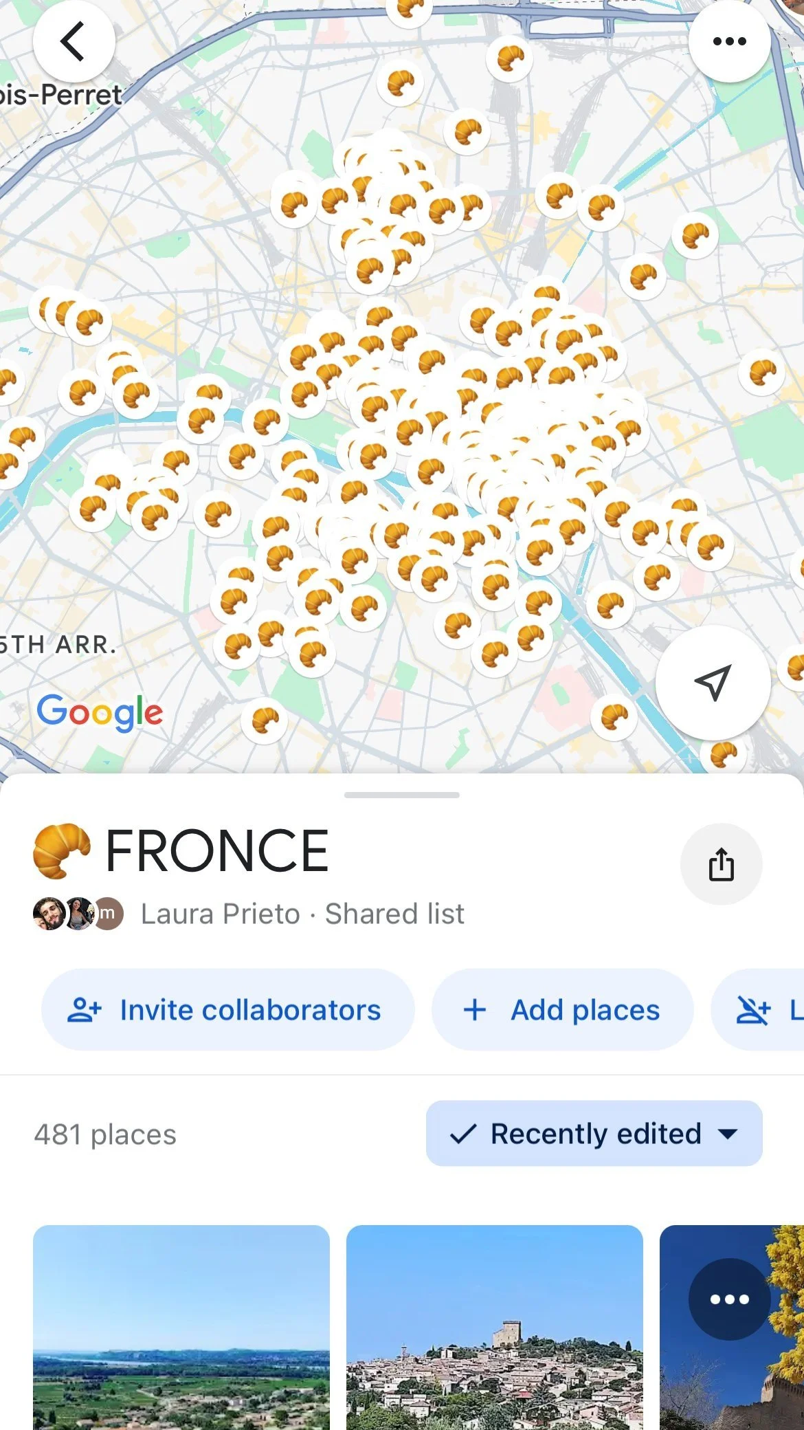
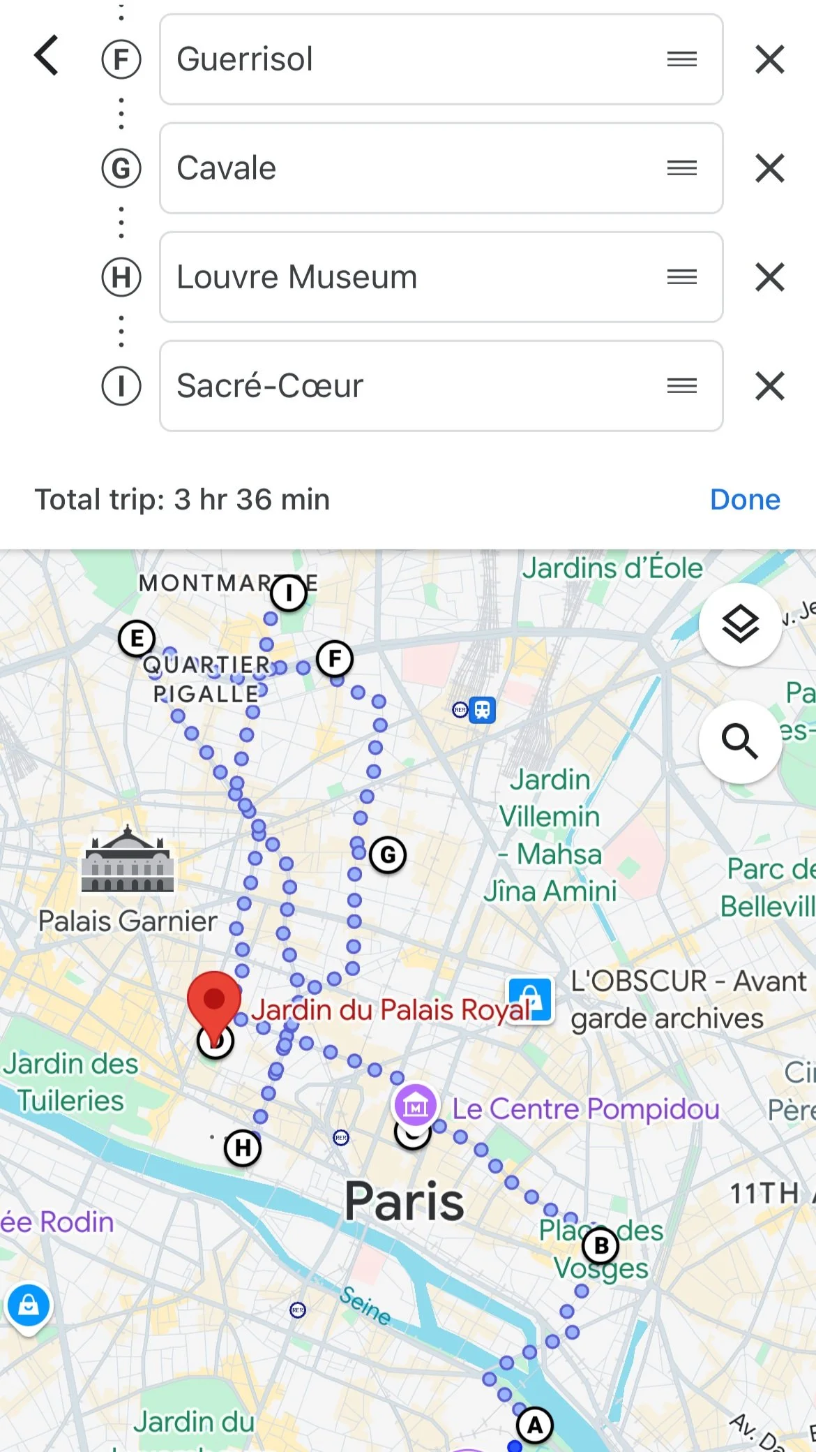
The places in Paris on our “Fronce” list.
Lists
The list feature on Google Maps is a great way to collect and share sights. My partner and I compile lists every time we go on vacation and we often share them with friends when they visit the same country.
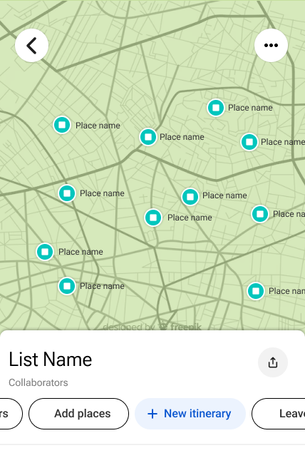
A user can create and add to existing lists under the “You” tab or by selecting a destination, clicking the Save button, and then selecting a list. Lists can be viewed as a list of destinations or on a map with customizable pins. The user can get directions to list items easily, but getting directions from item to item in a list requires using the “Choose starting point” pin-dropping feature. This involves hovering a red pin over other list items rather than simply selecting them.
This illuminates a glaring drawback in Google Map’s user experience. When requiring directions to a specific destination, the address of the starting point cannot easily be chosen through the map view. The destination has to be known beforehand or the inefficient “Choose starting point” pin feature must be used. So while a list affords the user the ability to see a bunch of attractions at once, the full set of requirements is not met. The list feature falls short in the following ways:
Ruling out attractions for a single-day itinerary would require removing items from the list defeating the purpose of having a list as a general store of knowledge whether or not the user will visit all the attractions on the list.
Even if a list represented an itinerary for the day, there would still be no way to quickly generate directions to each list item. This is because creating directions to and from several list items requires using the pin feature to hover over the list items rather than being able to select the list items themselves.
Directions and Adding Stops
The Canadian World War One Memorial at Vimy Ridge


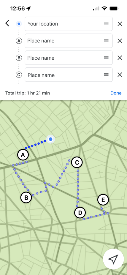
Another way for a user to see several attractions on a map at once is to simply choose a starting point and then add stops for each potential attraction on the itinerary. For road trips, this isn’t too inconvenient. Say a user’s potential itinerary was made of 5 small towns along the countryside. The user would add all the towns they wanted to visit, see which, if any are too out of the way, delete those towns as a stop, and then reorder the towns in a way that satisfies them. Under this flow, the user can generate directions quickly and while they cannot be saved in the app itself, they can be shared with other people essentially saving them in the user’s messaging app.
Unfortunately, this workaround does not scale very well. For walking itineraries with 10 to 20 potential attractions a lot of data entry is required and the map interface grows crowded very quickly. If attractions are far apart from each other but are added as stops consecutively, the directions provided will not come close to resembling the actual route the user will eventually create. This user flow can quickly become a big mess with overlapping blue routes with less salient black and white lettered pins scattered around the map.
Problem Solving
Discussion
I’d like to close this case study by returning to the concept mentioned earlier in this piece about culture being a form of human information system, specifically how culture constrains and promotes certain behaviour similar to how designers craft digital experiences. A culture is a set of formal and informal rules developed over long periods, tested continuously generation after generation. Cultures develop based on the scarcity of resources in their initial and immediate environment but evolve by incorporating new technologies and modifying their informal and formal rules accordingly. Humans have progressed from hunter-gatherer to agrarian to industrial societies and so have the rule sets that make up their cultures. When on vacation we adapt to different cultures to keep the peace, respecting the society that welcomes us while empathizing deeply with their way of life. While parts of our cultures overlap, the diversity at the heart of where cultures differ is a joy to experience and part of why we travel in the first place. Downtown Toronto was similar to parts of Paris, the lifestyle in the Côte d’Azur reminded me of Italy, and France as a whole influences Quebecois culture. But differences do abound. Not to the extent that things feel completely foreign but to the degree that you find yourself navigating a new territory with a good, but hardly perfect map.
Like cultures, technological interfaces have developed over time. We’ve come a long way from grunts being the only way to communicate information, but certain principles remain relevant in how we transmit information through culture, which now includes digital media. Our interfaces have evolved, discarding less efficient components and layouts for new ones. The maximal makes way for the minimal as we slowly chip away at superfluous elements in our strive for computational efficiency. Infinite content streams, menu bars, and like buttons may rule the day, but new technological innovations may change how these features function or if they have any utility at all. While we’re all using the same set of core design principles, different industries have different best practices, that is, they have different design cultures! I’m probably better traveled in the digital realm than in the real world allowing me to easily adapt to the design challenges in front of me, no matter the type of product. But more experience can never hurt. These case studies expand my experience with different products, allowing me to hone my cultural competency so that I can better fit in with the locals. Much like travel, this is a tremendously rewarding experience that is sure to foster growth and wisdom. It’s also fun and why design will always be one of my greatest passions. Until next time!

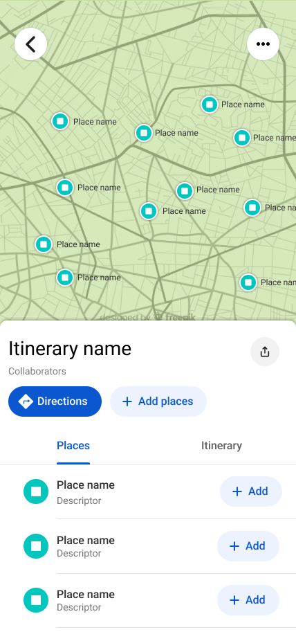
After analyzing how to adapt certain existing user flows to satisfy the user story and understanding where these flows fall short, a simple solution emerges that blends the functionality of lists with the process of adding stops to a set of directions. Here is the user flow:
The user creates a list or views an existing list.
The user adds places to the list. (Optional)
The user creates an itinerary and selects which places from the list will make up the places in their itinerary.
A set of directions is created from the itinerary.
The user can update the directions as they normally would.
Let’s further detail the user experience at each step along with wireframes of what these steps may look like. Since Steps 1, 2, and 5 are existing features in Google Maps, let’s jump straight to Step 3.
Step 3: The user selects which attractions will make up the itinerary.
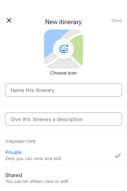
Firstly, I need a button to start creating an itinerary. There already exist 3 buttons related to the list feature so I would simply add a fourth button in between “Add Places” and “Leave” called “New Itinerary.” The horizontal buttons are arranged in a way that the Leave button would be offscreen and the new button’s icon would just barely be visible. Scrolling horizontally to access the Leave feature is an acceptable consequence of adding the new feature assuming people leave lists infrequently. The barely visible button communicates to the user anyway that more options are available.
Now that the user has created a new itinerary they need ways to add attractions to their itinerary. They should be able to do this in 2 ways with a 3rd way as a nice to have. They are as follows:
Selecting a pin from the map view.
Selecting an item in the list view.
As a nice to have, the user should be able to add items not already in their list.
Selected itinerary items should be visually different than unselected items and a sub-list should be simultaneously created with these itinerary items in the list view. The itinerary can be edited by deselecting pins or deleting list items.

The most intensive development work likely results from generating directions from a set of places. Currently, the user selects the order of places for directions and is limited to 9 locations so the development of the itinerary feature requires the creation of a new set of business logic governing how to order an itinerary.
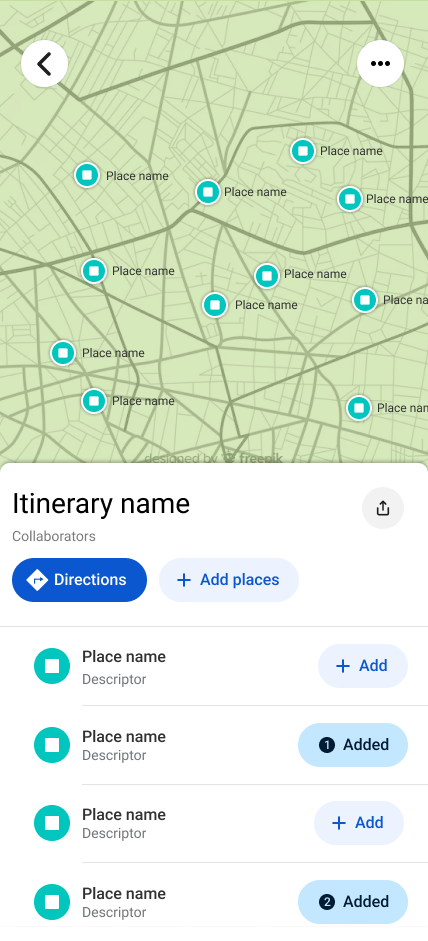
Therefore, the MVP version of this feature would also likely require the user to select the order with the system only offering one-way directions. The interface may look something like the 2nd design on the right where the “Added” button displays the order of selection of each place. Unfortunately, the numbered icons do not currently exist in Material’s set of symbols.
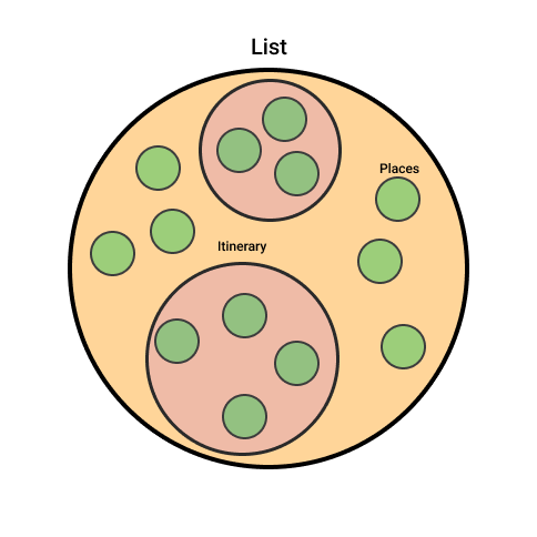
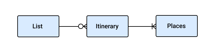
Lastly, I’ve added some diagrams below that explain the relationships between entities in this solution. Where possible, I like to include these in my work to help convey my solution in different ways for different learners.
Closing Remarks

The Eiffel Tower peeking throw the late-summer Parisian trees.
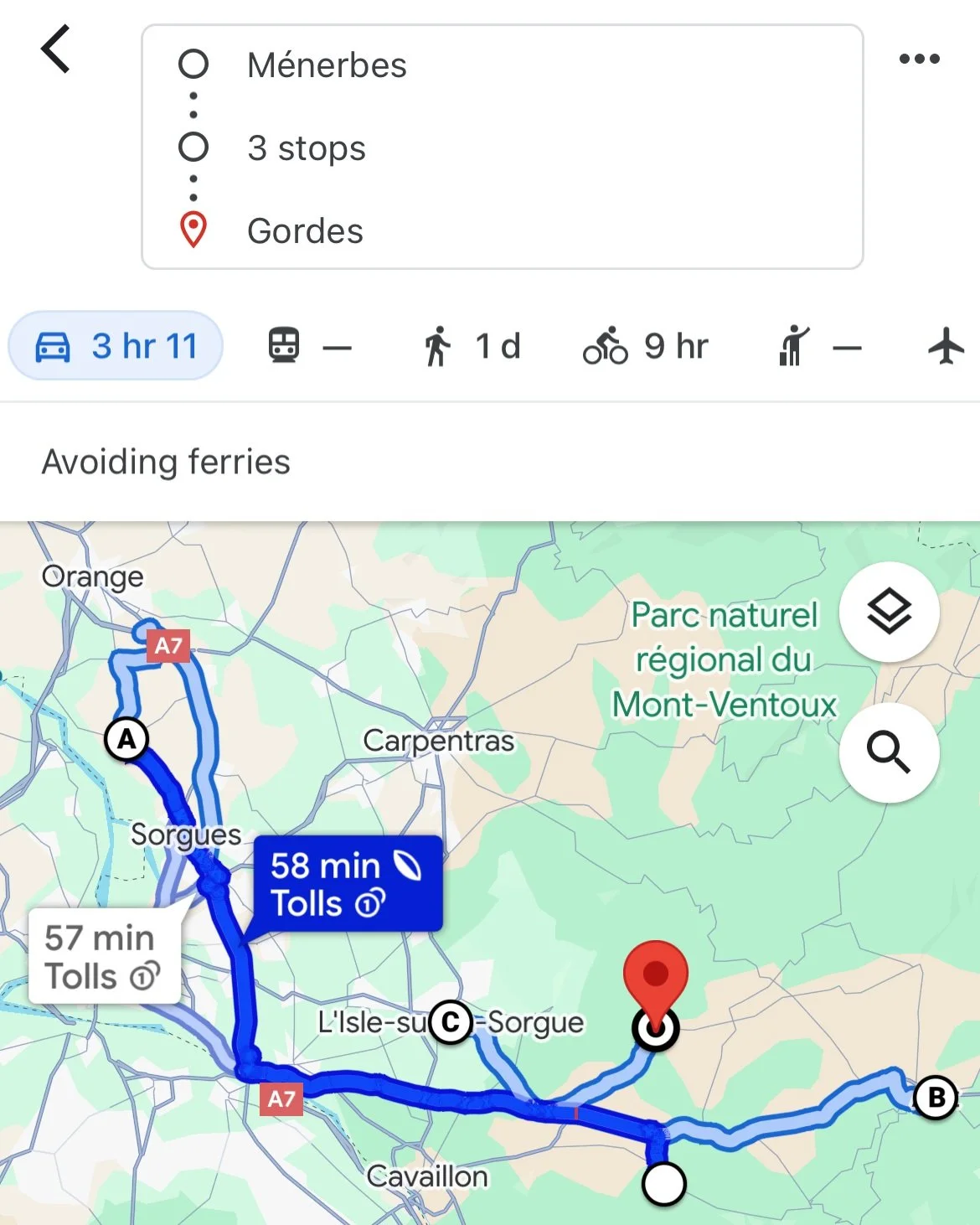
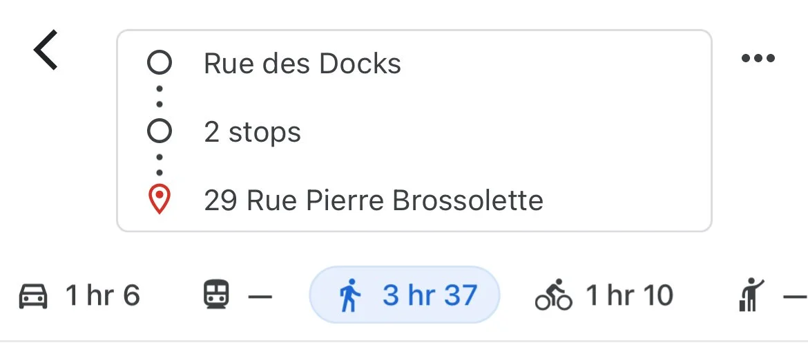
A Driving itinerary (left) with 5 stops presents a manageable case for creating itineraries this way. The walking itinerary (right) exposes the limits of the workaround.
As another nice to have, the user should have a way for the directions to make up a one-way or roundtrip route. For example, say there are a bunch of attractions near a starting address with one or two attractions located a 20-minute walk away. A one-way route would see the endpoint be the further attractions with closer attractions clustering at the beginning of the itinerary. Whereas a round-trip route would split up the closer attractions; some at the start of the itinerary and others after the further attractions are visited. The location of this option would be under the ellipsis in the screenshot to the right.
Lists under the “You” tab
The tedious pin dropping feature
On the left, the “New itinerary” button slotted between the “Add places” and “Leave” buttons. On the right, the “New itinerary” naming screen mimicing the “New list” naming screen.
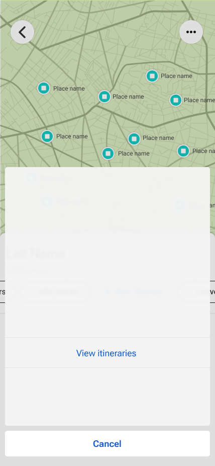
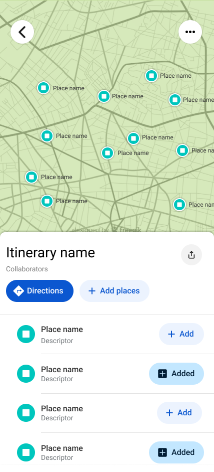
On the leftmost screen (1), the “Places” tab shows a list of all places in the List. The user can add places to their itinerary by selecting “+ Add,” selecting pins on the map, or by selecting the “Add places” button. This latter option temporarily sends the user to the generic search screen to enter an address or point of interest name. This button adds places both to the itinerary and the list. To the right of this screen (2), the “Itinerary” tab shows a list of places in the itinerary. The user can remove places from their itinerary here or by deselecting pins on the map or by pressing the “Added” button. The “Directions” button creates directions to the selected places satisfying Step 4 in our user flow. Third from the left (3), the walking directions are produced once the user selects “Directions” on screen 2. On the screen furthest to the right (4), we see the drawer that opens when selecting the ellipsis in the top right-hand corner of the standard List view screen revealing the “View itineraries” action.
The ellipsis in the top right-hand corner of the directions screen houses the round-trip checkbox feature.
The general feasibility of the solution prescribed in this case study is difficult to ascertain. I will note that the use of tabs for Places and Itinerary departs slightly from how they’re used by Google today, in that tabs are mostly used to store separate functionality rather than dividing list items into a sub-list like what is used for the itinerary feature. Additionally, the multi-selection of objects on a map like list items is currently not supported by Google. Therefore, in its most simplistic form (suitable as an MVP), the solution can still function like the mockup (1) below where the user scrolls down their list and adds items to their itinerary. These items change to the “Added” state with no change to the pin colour on the map.
On the left screen (1), note the removal of the Places and Itinerary tabs. On the right screen (2), note the numbered “Added” buttons that denote the selection order of places in the itinerary.

The whole fam on our final day!